3-in-1 Color Tool and inspired wool.
Imagine this: You’re in rug class hooking away and your instructor comes along and suggests you need a bit of chartreuse to spark up your rug. Alarm bells go off. You know that poisonous green will not work with your color plan. What is she thinking?
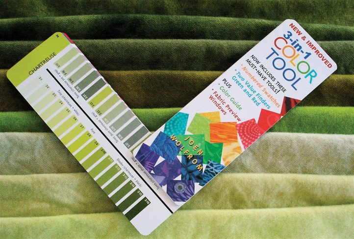
Several years ago, I bought a color aide called 3-in-1 Color Tool by Joen Wolfrum. In it, the 24-part color wheel is arranged like a paint deck, one color per page. On that page you can see the color at its full saturation, from the lightest of light—bright and dull—to the darkest of dark—bright and dull. For me, it’s the perfect way to show people the variety of “children” in any given color family name. It also includes a red and green value finder (yes, you need both: red for cool colors, green for warm), color matching guides, a view finder, hints, and a ruler. This great tool is readily available from online bookstores or quilt stores.
But back to the teacher who wants you to add chartreuse to your rug….
At your dubious look, she pulls out the 3-in-1, which is also a great tool for students and teachers to discuss colors in rugs because each color is numbered for easy reference. One look at the 24 variations of chartreuse and you now have a much clearer idea of how a so-called poisonous color could actually liven up your rug. Like every color, chartreuse can appear in many ways, and at least one is suitable to any palette.
To show you how this tool can become a strong path for the freeing up of our dyeing practice, I decided to replicate some of the 24 chartreuse colors with our dyes. I didn’t give the recipes fashion names; rather, they are titled according to their location on the 3-in-1 Color Tool page of chartreuse colors.
This time while dyeing, I finally noticed what others have been telling me: it is taking ages for the yellow in my recipes to take up—especially the dark one. It took so long that I was able to finish dyeing all the other wool while I waited for the water to clear. In the past I’ve suggested that you up the acid level when you dye dark colors, and now I’m suggesting that you add extra synthropol to these dye baths and add even more acid than usual. Try adding 1 tsp. for the darker colors and 1/2 tsp. for the medium colors.
Note: All the tints are the same value; Pure Chartreuse is one value darker. All the grayed-out samples are the same value as Pure Chartreuse. Keep that in mind if you want to use Pure Chartreuse and the grayed-out colors together for richness or to provide contrast in your rug; they will blend.
Dye Recipes
Soak 1/8th yard of natural wool in synthropol until it is wet. Use a kitchen kettle, a crock pot, or a frying pan to make a dye bath on top of the stove or in the oven. For smooth results, stir lots. Add dye (I used Majic Carpet dyes) to the bath, add the wool, stir it around, wait 5 minutes or so, and add acid. Wait for the water to clear.
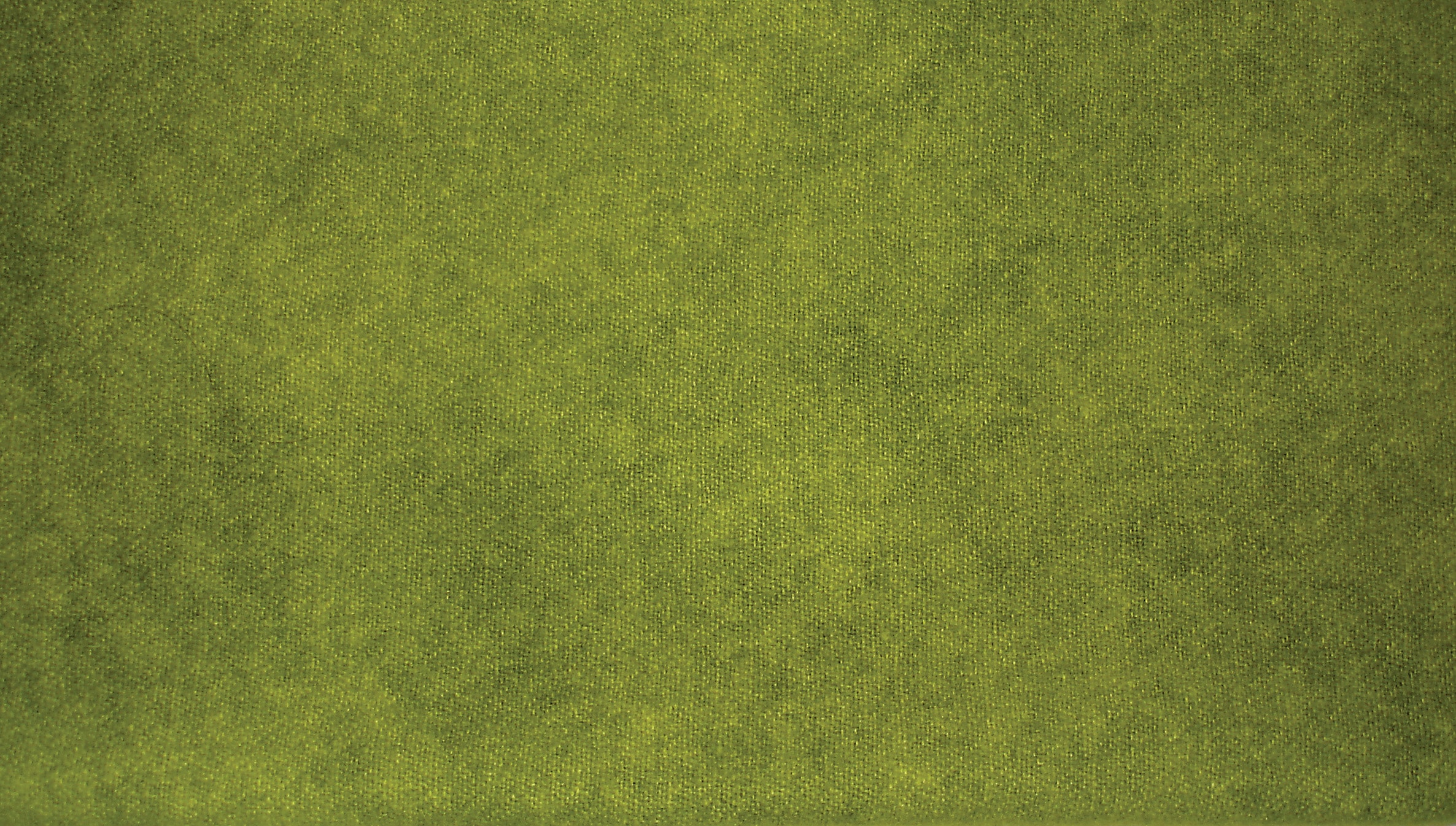
Dye Recipe 1: Pure Chartreuse
Pure Chartreuse
- Pure Chartreuse 2/32 tsp. Yellow
- 1/64 tsp. Turquoise
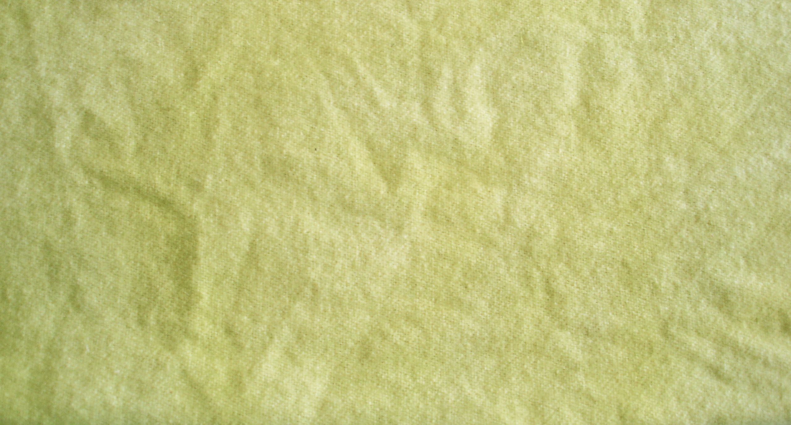
Dye Recipe 2: Pure Tint
Pure Tint
2/32 tsp. Yellow
1/64 tsp. Turquoise
Mix in one cup of water (1/4 c. boiling water, stir to dissolve dye, then top it off with 3/4 c. of water), but use only 2 Tbsp. of this formula to create the Pure Tint pictured here.
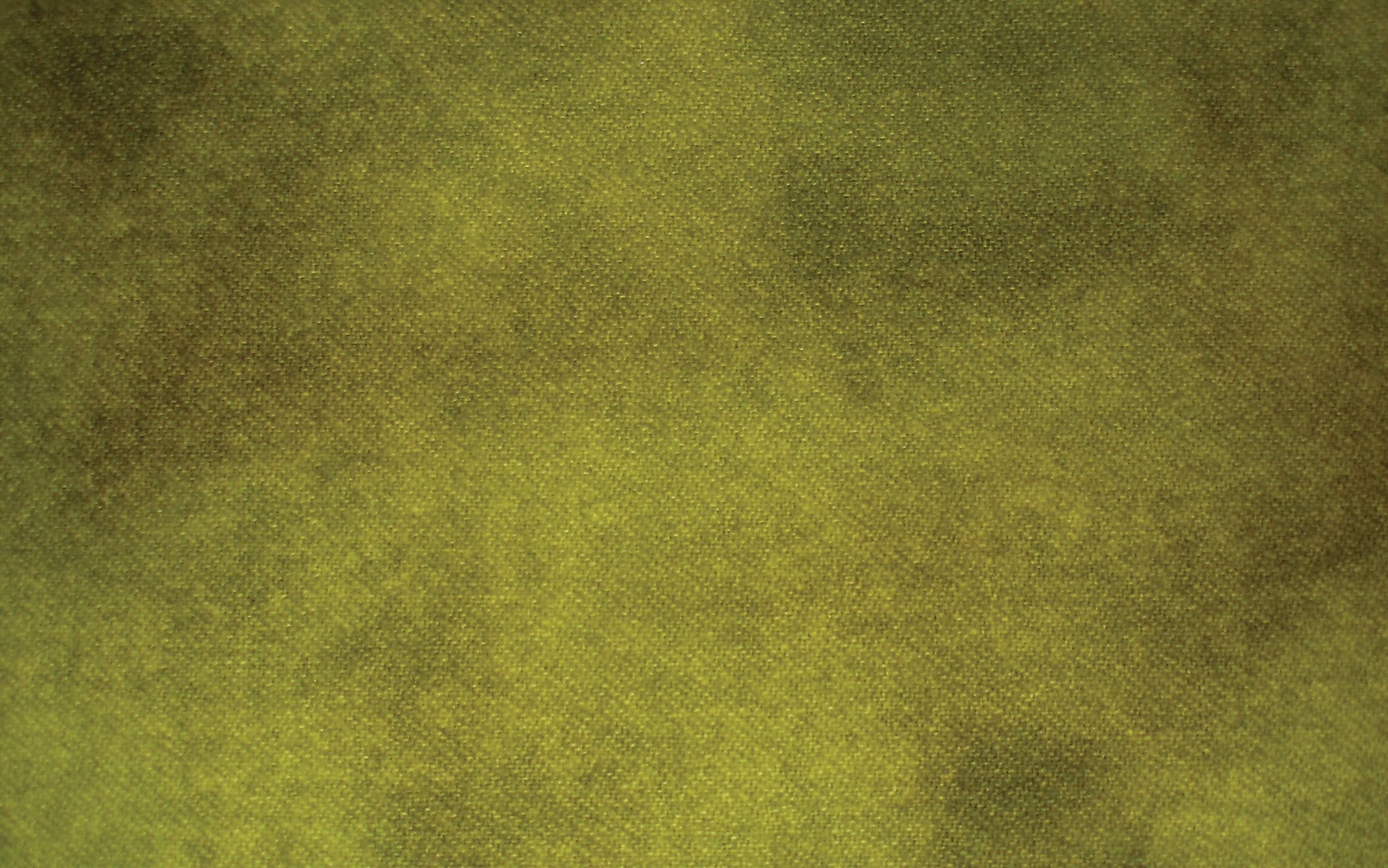
Dye Recipe 3: Chartreuse Shade
Chartreuse Shade
6/32 tsp. Yellow
3/64 tsp. Turquoise
1/64 tsp. Black
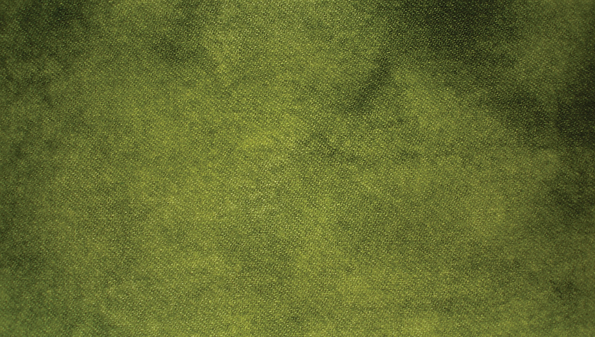
Dye Recipe 4: Pure + Gray
Pure + Gray
2/32 tsp. Yellow
1/64 tsp. Turquoise
1/128 tsp. Black
Dye Recipe 5: Complement Graying
COMPLEMENT GRAYING
2/32 tsp. Yellow
1/64 tsp. Turquoise
1/128 tsp. NF (new formula) Red Violet
Dye Recipe 6: Grayed Tint
Grayed Tint
1/32 tsp. Yellow
1/128 tsp. Turquoise
1/128 tsp. black
Mix in one cup of water (1/4 c. boiling water, stir to dissolve dye, then top it off with 3/4 c. of water), but use only 2 Tbsp. of this formula to create the Grayed Tint pictured here.
Remaining Grayed Tint
Remaining Grayed Tint
Pour the remainder of the dye formula into the dye bath to create
a medium value tone. If you like this color, don’t worry: you can use the whole Grayed Tint formula—two tablespoons of dye added in will not make a perceptible difference to the color.
Dye Recipe 7: Even Grayer Tint
Even Grayer Tint
1/32 tsp. Yellow
1/128 tsp. Turquoise
1/64 tsp. Black
Mix in one cup of water (1/4 c. boiling water, stir to dissolve dye, then top it off with 3/4 c. of water), but use only 2 Tbsp. of this formula to create the Even Grayer Tint pictured here.
Remainder of Even Grayer Tint
Remainder of Even Grayer Tint
Use up the remainder of the dye in the cup from the even Grayer Tint. The rule applies here, too: you can mix up the Even Grayer Tint formula and use it all without a noticeable difference in appearance.
What did we learn?
- Color families have a head of household. That head color is at its purest saturation.
- Lots of relatives live in that household, too. Our rugs can get along with two or three of them, I think.
- Try using a color you don’t really like to use. Because of our color prejudices, we naturally avoid colors that don’t appeal to us and rely heavily on colors that do. Our likes and dislikes create a color imbalance to the viewer.
- The colors you don’t like enhance the colors you love. Look to nature to see evidence of this all around us.
- Try making some tints—light colors, tones (by adding gray or complements), or shades (by adding strong black). Have fun exploring how the colors can work for you.
- Most importantly, I hope you learned to take a risk. For your next project, add a color you consider outlandish to your color plan. You’ll be pleasantly surprised by the results.