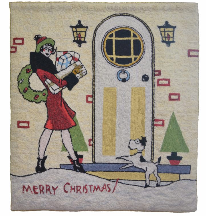
Home for Christmas, 29″ x 32″, #3- and 4-cut wool on Scottish burlap, designed and hooked by Joanne Thomason, Newton, Iowa, 2010.
Joanne found this image in an antique store among the old postcards. It was the size of a postcard, but was blank on the back. The tidy front door and Christmas decorations, as well as the fashionable fur collar and cuffs, suggest that this is an image of the ’40s or ’50s. This stylish lady’s arms laden with gifts resonates with advertising of the post-war years, when images of prosperity were very popular. “I used sparkly ribbon on one present, around the door, and for the binding,” Joanne said, “to give this rug a holiday feeling.”
Story by Tamara Pavich/Photography by the Artist
When she’s not hooking rugs or caring for her grandchildren, Joanne Thomason of Newton, Iowa, can often be found trolling through antique stores. While she likes vintage furniture, ’50s fabrics, and all things retro, what she’s really after is a certain kind of image from days gone by.
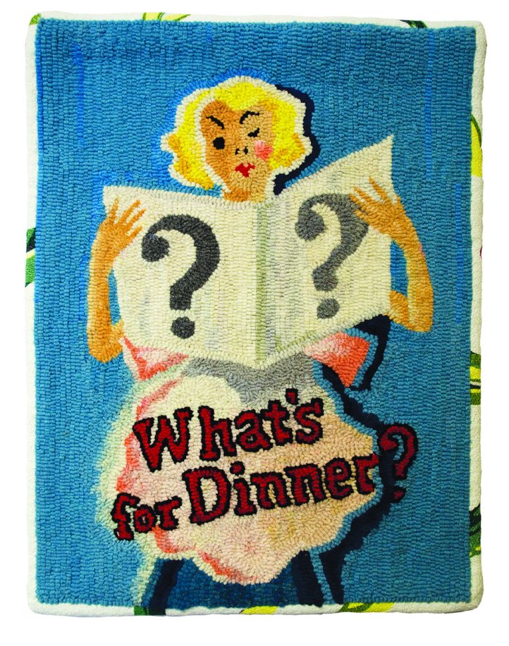
What’s for Dinner?, 18″ x 24″, #3 and 4-cut wool on linen. Adapted from a recipe pamphlet of the 1940s, designed, and hooked by Joanne Thomason, Newton, Iowa, 2014. EMILY THOMASON “I saw this cover and thought it was so cute,” Joanne said. “It’s a recipe booklet, and there was a lot of lard in those recipes!” With fresh lipstick and not a hair out of place, this lady of the forties is all glamour and composure, even as she considers what to make for the evening meal. Joanne’s clear colors are virtually primary: variations of red, blue, and yellow, along with flesh and neutrals. The border is done with bark cloth, “to add to the vintage look,” Joanne said.
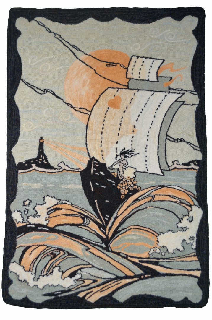
Love’s Song, 25″ x 36″, #2- to 4-cut wool on Scottish burlap. Adapted from a piece of sheet music of the 1920s, designed, and hooked by Joanne Thomason, Newton, Iowa, 2009. The woman at the helm of this vessel may be a bride on the way to her intended, wearing her heart on her sail. The limited palette uses only variations of coral and neutrals, a combination that is quite effective at depicting the turbulent sea. “New rug hookers should know that you don’t have to use eight values in order to achieve depth,” Joanne said. The large orb in the sky could be sun or moon. The style exudes the Art Deco look of the 1920s.
“I love bright, clear colors,” Joanne said. “That’s what I find in the graphic designs on old brochures, advertising pamphlets, and sheet music illustrations. And there’s something about the ladies in those illustrations that especially speaks to me. They’re so charming and feminine. I see an illustration, and I just know I want to hook it.”
Twenty-five years ago, Joanne discovered hooked rugs in Country Living magazine, and she wanted to create some hooked pieces for her own home. Without a teacher or a hooking community, she tried to find the materials she needed. With some loosely woven burlap and bolt wool, she made “little squares that fell apart.” But eventually, she found the instruction and support she needed right in her home state of Iowa. “When I learned about the camp at Decorah, I was very green,” Joanne said. “But fortunately for me, Barb Uphoff was my teacher. I loved her and kept going back. Barb taught in the basement classroom, so we, her students, called ourselves the Cellar Hookers. We had no desire to go upstairs, because it was so much fun to learn from Barb. She taught us more than just hooking. Barb taught us to dye wool, too. And what I appreciated most was that she let me develop my own style. She stopped teaching eventually, and we all had to go upstairs. She was a wonderful teacher.”
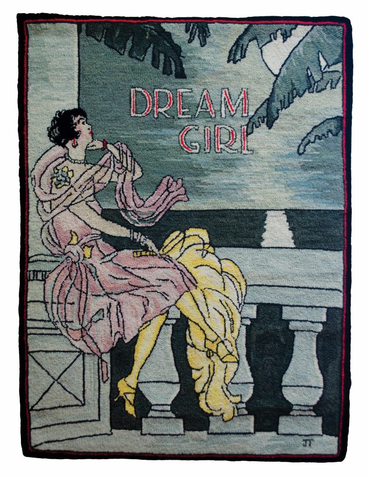
Dream Girl, 29″ x 32″, #4 and 5-cut on Scottish burlap. Designed and hooked by Joanne Thomason, Newton, Iowa, 2008. EMILY THOMASON “This was a hosiery package illustration,” Joanne said. “It said the hosiery was guaranteed silk, ‘Once worn, always wanted.’” The rug’s charms are in its simple asymmetrical composition, vintage style, and limited color palette. This glamour girl of the 1920s, draped in jewels and chiffon, perches on a balcony with classical architecture, gazing at the moon’s reflection on the water. The fronds, as languid as the dreamer, suggest a tropical location. “The sheer dress and wrap were a challenge to hook,” Joanne said. This rug was previously published in a book by Jessie Turbayne.
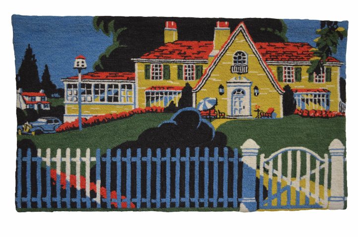
Home Sweet Home, 34″ x 20″, #2- to 4-cut wool on Scottish burlap. Adapted from a 1930s advertising booklet, designed, and hooked by Joanne Thomason, Newton, Iowa, 2015. JOHN LEE By hooking on the tightly woven Scottish burlap, Joanne was able to capture the tiniest details of the illustration. “I used a #2 cut for the tiny furniture details and part of the car,” Joanne said. “For the rest of the rug, I used #3 and #4 cuts. I am drawn to people and places of the 1930s, ’40s, and ’50s.”
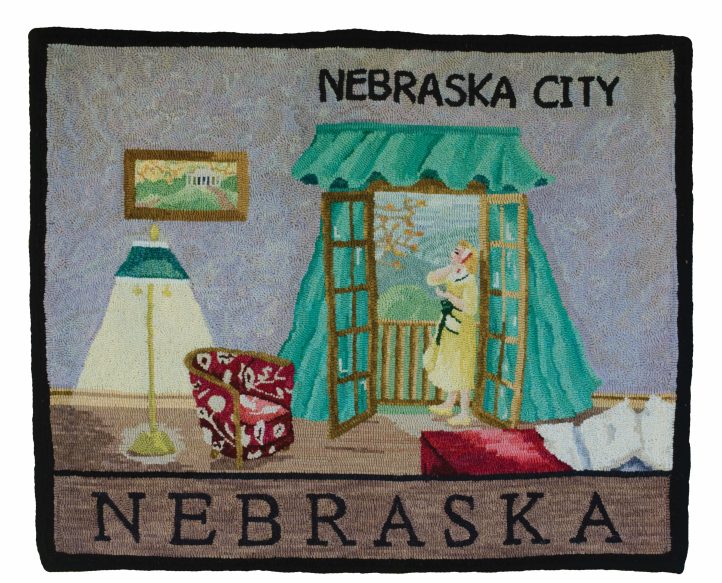
Nebraska City, 29″ x 36″, #4- and 5-cut wool on Scottish burlap. Designed and hooked by Joanne Thomason, Newton, Iowa, 2016. EMILY THOMASON “This was a group project with Janice Lee,” Joanne said. “Each of us chose a subject from a town in Nebraska. It’s my original design, taken from my room at the Lied Lodge at Janice’s rug hooking retreat in Nebraska City. I wanted it to feel retro. The wind was blowing through the French doors that first night, so I included the blowing curtains in the design. The framed picture on the wall of the room is the historic home of J. Sterling Morton, the founder of Arbor Day Farm and Lied Lodge.”
Little Cottage, 24″ x 16″, #3- and 4-cut wool on linen. Designed and hooked by Joanne Thomason, Newton, Iowa, 2010. EMILY THOMASON. “At the famous antique fair, Round Top, near Houston, Texas,” Joanne said, “I found three hooked stair treads that were falling apart. I thought they looked comforting and homey. This is a new version of one of them.”
That was a long time ago. This year, Joanne made her first submission to Celebration, and her adaptation, Home Sweet Home, was selected by the judges. In this rug, she had adapted an old paint brochure from the 1930s. Although it doesn’t feature a lady of that period, it does employ the clear bright colors that Joanne loves best. Her teacher, Katie Puckett, “dyed the wool perfectly,” Joanne said. To render the minute details in these kinds of illustrations, she uses finer cuts of wool; however, she usually doesn’t do any fine shading. Rather, she mimics the flat colors and graphic styles of a given period.
For a stroll down memory lane, have a look at Joanne’s ladies and scenes, some from nearly a century ago. They evoke a time in history when a girl put on her lipstick before she cooked dinner.