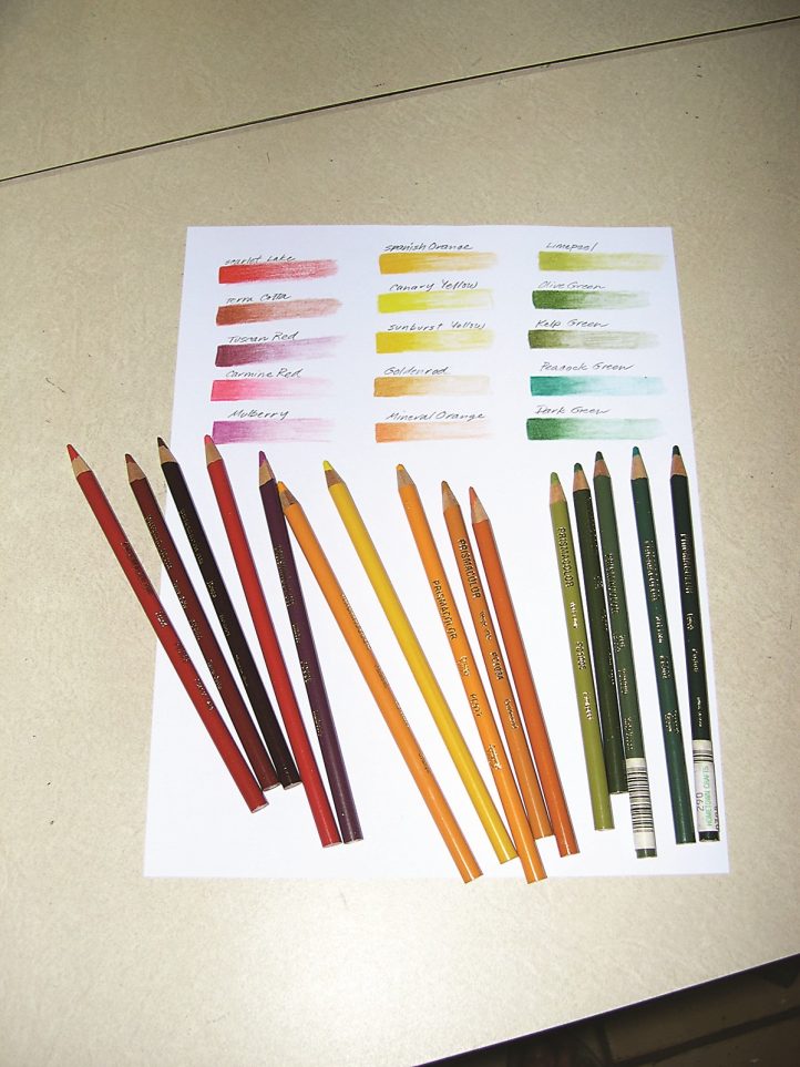
Figure 1. A 1/2″ x 2″ swatch shows the transition from heavy pressure (dark) to light pressure (light) for each color in your palette. Group your colors in a spectrum of values to get a good idea of what the actual lead colors look like. Sometimes the painted pencil exteriors don’t quite match the true lead color.
As a child I loved coloring books and big boxes of crayons. The bigger the better. And I have never outgrown the love of coloring. So when I acquired the tin set of 120 Prismacolors some years ago, it was very much like getting my first box of 64 Crayolas. Only this time I was coloring my very own designs.
To conquer color planning on paper, you have to be familiar with your tools. Start with a nice selection of colored pencils and regular printer paper. If you want to be organized about it, color in an approximate 1/2″ x 2″ swatch to show a transition from light to dark for each color in your palette. (See Figure 1.) To see a spectrum of values that any given color can produce, vary the pressure as you color. This exercise will also familiarize you with what the actual lead colors look like because sometimes the painted pencil exteriors are slightly off in their representation of the true lead color. Keep this swatch record for reference in all your future color planning until you become familiar with the pencils.
Getting Started
When I color plan for students, I always start with a line drawing of the specific pattern. I use 81/2″ x 11″ sheets of paper with the pattern drawn as large as possible to fit the page. If a pattern has repeat motifs, I copy a full repeat on a single sheet. If it has many details that cannot be addressed on a single sheet, I compose the full design on two sheets or on an 11″ x 17″ sheet copied at a commercial copier.
It is important that the line drawing be a very light gray copy. (See Figure 2) Black lines create definition in a composition, but using color or value to create contrast is more valuable in color planning. Having a very faint line allows you to create the contrast you are after without dependence on a dark black line. To get a faint image from your printer, use light/dark control options. Print your drawing on the lightest option, then copy that drawing out again on the lightest option. You may need to repeat this process several times. Your drawing should be just dark enough to see the image, but light enough so that a colored pencil can easily cover up the lines. Make four or five copies to have handy for restarts or corrections.
A Bit about Blending
Prismacolor pencils are as varied as the size set you purchase. And many of the colors will be useful just as they are. The black and different browns, for instance, work well for basic background colors. Some of my favorites, which I use frequently as is, are Tuscan Red, Kelp Green, Aquamarine, and Limepeel. When using the colors as is, start out with medium pressure and darken the color by adding pressure until you get the value you want.
You may still want to blend the colors to eliminate the tooth, or texture, of the paper. If so, go to one of the lightest values in the same color family and apply it on top of the last layer with moderate pressure. The most frequently used colors for muting and blending are the lighter of the French, cool, and warm grays, along with Sand, Pale Sage, Cloud Blue, and Rosy Beige.
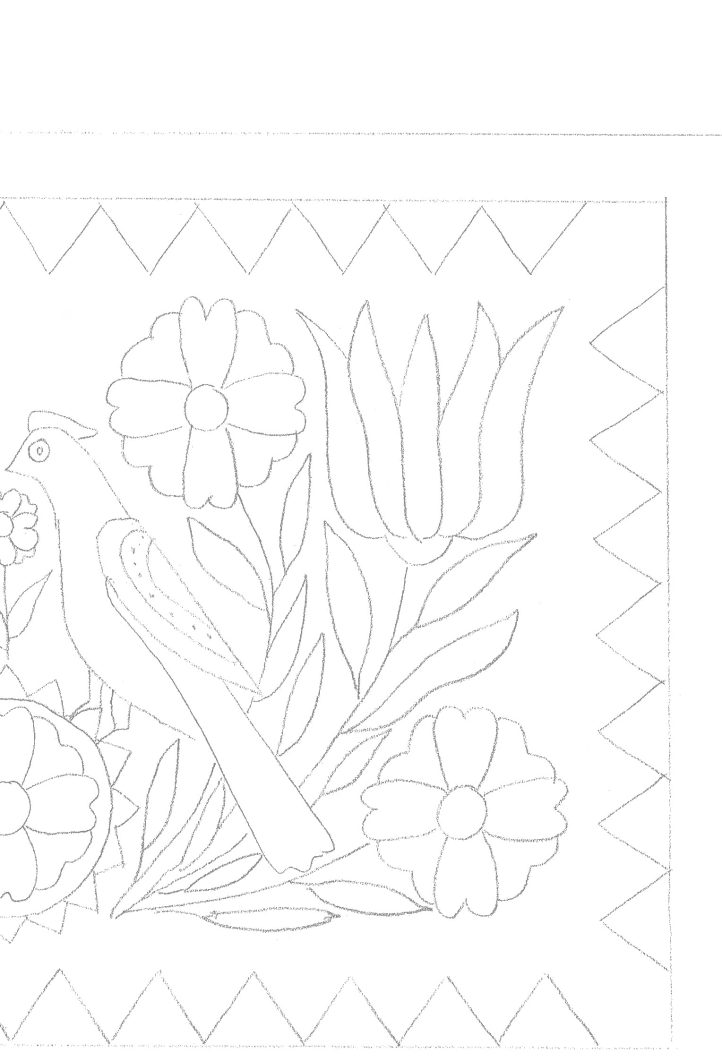
Figure 2. Photocopy or print your drawing several times until it is just dark enough to distinguish the linework but light enough so that the lines can be covered when you outline them with a colored pencil. This illustration demonstrates the faintness you will want to achieve.
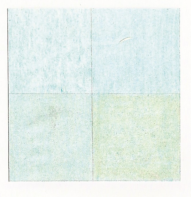
Figure 3. A Light Aqua square divided into four parts shows the effects of blending Powder Blue, French Gray 10%, and Gingerroot into the original color.
As an example, I have often used the following combinations for blending: Tuscan Red with Grayed Lavender; Kelp Green with French Gray 10%; Aquamarine with French Gray 10%; and Limepeel with Celadon. When I am not sure which combination will yield the exact color I am looking for, I test it out on scrap paper until I am satisfied. Only then do I feel brave enough to apply it to my line drawing.
Finding a Background Color
The most important step is deciding on a background color—Will it be light or dark? What color?—and now is the perfect time to experiment with the blending qualities of the Prismacolor pencils. Experiment on a scrap piece of paper to test out your colors before moving ahead to your drawing. I use ordinary all-purpose printer paper. For the purpose of experimentation, let’s say you want a light to medium muted turquoise. Begin with a light coloring of Light Aqua in an area approximately 2″ x 2″. (See Figure 3, above.) Divide that Light Aqua square into four parts. To alter the color, try a different blending color in each square. See what happens when you blend one square with Powder Blue, another square with French Gray 10%, and a third with Gingerroot. If you press a little harder with these blending colors, you’ll see the tone of the Light Aqua change.
Here are some other layering combinations to try. Be sure to use slightly more pressure with each layer, applying the fullest pressure on the last layer.
Light Gold
- Cream
- Goldenrod
- French Gray 10%
- Cream
Spring Green
- Limepeel
- Kelp Green
- Limepeel
- Pale Sage
Dusky Blue
- Peacock Green
- Blue Violet Lake
- Cloud Blue
Brick Red
- Raspberry
- Tuscan Red
- Henna
I generally use a lighter value (sometimes white) to blend the colors together. To enhance the tone of a color and preserve its brightness, I finish with the lighter-valued color from the same family of colors already layered. The final layering of Cream in the Light Gold swatch is an example.
If I want to alter the tone of a color by muting it, I bring in a color with some complimentary tones to soften the intensity or brightness. There are cool grays, warm grays, and French grays (even warmer) that come in percentage increments. The higher the percentage, the darker and stronger the influence of gray, and the duller a color will become. For example, the French Gray 10% dulls the previous two colors in the Light Gold swatch.
Coloring Motifs
When you have filled in your background, you are ready to work on the motifs. Keep in mind special details like outlining, double outlining, beading, and shading when you make decisions about how to treat motifs. The more detail you work into your color plan, the better prepared you will be when it’s time to hook. The object at this stage is to prepare an overall color scheme and yet remain open to minor changes or adjustments in the final hooking of your rug.
When I want to show where a highlighting outline will go, I apply sufficient pressure to my pencil so the color appears very strong. If your outline will be a light colored wool against a dark background, use the lightest value of the color you want it to be. (Figure 4.) The petals of the medallion were first outlined in Cream applying good pressure, then I lightly penciled Goldenrod over it to give more golden tones. Then I used the Cream pencil again to blend the two layers together. I used a similar technique to outline the leaves.
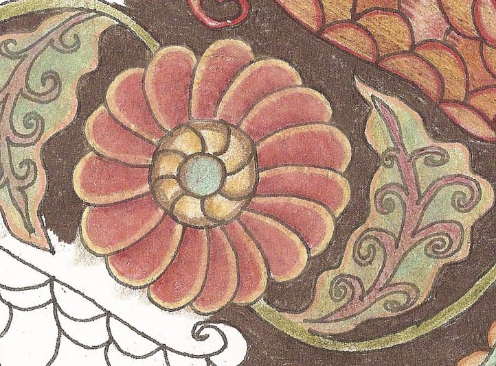
Figure 4. To highlight the central motif in Summer Winds, I applied Cream with good pressure to the outlines of the petals, then I lightly penciled Goldenrod over the Cream to give it a more golden tone. A final application of Cream blends the two layers together.
One popular technique today is beading. It lends a crisp spark to your rugs and is easy to show in your color plan. (Figure 5) To show an area where I want beading, I make “notches” with a broad-pointed color pencil. In Figure 5, those notches were made with a red pencil and sufficient pressure so that they would read strong enough against the sand color.
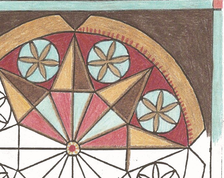
Figure 5. To indicate beading along the inside rim of the outer band before transitioning to the outer sand-colored band, I drew “notches” with a red pencil. I purposely omitted the beading from the left side of the color plan to test out which version would be more appealing.
Eliminating the Risk Factor
Whether you are a fine shader or like to play around with wide-cut mock shading or dip dyeing, planning ahead on paper can help. Although I work in wide cut, I have used mock shading in my rugs, color transition, and graded swatches in a #8 cut. My pattern for Rebecca Jr. is a fitting example. (Figure 6)
Figure 6. This rendering shows a simple color gradation from dark to light. I started with a light application of color throughout the shape then applied a gradual pressure to areas that would be darker. Once I got the transition worked out with the single color, I went over the coloring with a compatible light-colored pencil to blend it all together.
I had planned this pattern numerous times in an outline and fill method, which worked for a number of my students. But in one workshop, I had a student who needed a little more finesse to keep her visually motivated. I thought about using graded swatches and was curious to find out what this pattern would look like if it were hooked that way.
Instead of investing time and effort to dye the swatches on a risk, I color planned a graded version to better visualize the outcome. Completing the color plan gave me the assurance and enthusiasm to move ahead on my hunch because it was easy to see that the use of graded swatches would make for a high-impact rug. Staying in a wide-cut mindset, the student hooked the rug in predominately #6 with #7 or #8 cut in the background.
Weighing Options
When I first started using Prisma-colors to color plan, I found that I kept making errors in color decisions during the planning process. These errors would happen with rugs that were a little more complex, or where I was striving for an effect that I had not used in the past. I would proceed with the color plan, and then about two-thirds of the way into it, I would realize that another color choice would have been more suitable.
At that juncture, I realized that I had two options: one, trash my first attempt and start over; or two, fake my way through when it came time to assemble the wool. Well, option number two had too much risk, and option number one was not particularly inviting either. Necessity being the mother of invention, I retrieved an old cut-and-paste technique from my graphic design days way back before we had computers to make corrections.
Remember how I advised you to make four or five copies of the line drawing? Here’s why: when you have an area in your color plan that you want to change, you can easily change it by making the correction on an extra copy. First, using a sharp X-Acto knife, cut out the area that needs to be changed, leaving a window in your rendering. You can cut the shape out exactly, or you leave a little extra space around the motif. (Figure 7.) Second, make the necessary color correction on an extra copy. Make sure to fill in the background area if you cut out a shape that was a little larger than the motif. Third, put the newly colored motif behind the window in the original to check and see if it is the improvement you were after. Finally, if it works well, cut a patch from this correction. The patch should be just a little larger than the window in the original. Run a glue stick on the back of your original and then position the patch. Voila! You don’t have to start over. And this technique works equally well with motifs in the dead center of the composition and in borders along the edge.
Figure 7. You can easily correct your color plan. Simply cut out the original motif and slide in a newly colored motif made from one of your extra copies. Notice that the paper’s edge may show depending on the depth of color hitting right against it. I like to lightly color the white edge so it does not distract from the overall color plan.
For me, Prismacolors have taken the uncertainty out of color planning. I work with a number of swatch sets out on the market (Mellow Colors by Susan Quicksall, Primary Fusion by Ingrid Hieronomous, and my own Gemstone Colors) that will match just about any color I can come up with using my Prismacolors.
This method of planning is not meant to be a foolproof way of color planning but more of a support from which to make minor decisions. It lays the groundwork for the overall feel of the rug, but you’ll find you will still need to make minor adjustments along the way. If your wool closely matches the colors in your rendering, you can move ahead with reasonable assurance that your project will result in a satisfying, colorful conclusion.
Why Blend?
Blending may seem like an unnecessary extra step, but it’s actually a very important part of color planning with pencils. When you use a hard medium like colored pencil on paper, you are left with the texture of the paper showing through—that’s those grainy white speckles that did not make contact with the pencil lead. You can press harder to force the lead to make greater contact, but blending with another shade is a better option. It smears the original waxy color into the grain of the paper and coats the overall surface with a lighter cast of color. In addition, eliminating the grain by blending gives a truer representation of the color you will eventually try to match up with wool. Think of it this way: If you color lightly and the grain of the paper shows through, then what color are you truly trying to match? Is it the colored pencil color, or is it the combination of color and white paper?
More on Colored Pencils
My skills have gotten a little more sophisticated since my art school training, but I have to credit Prismacolors and the marvelous medium that they are. Many brands of colored pencils are available, but what separates Prismacolor from the rest is the binder-to-pigment ratio. Prismacolor puts more pigment in the leads, which results in more saturation of color in the final product. The leads are softer too, which makes them receptive to blending. You have to sharpen them with a very sharp sharpener and treat a highly sharpened point a little gingerly, but the result will be well worth it. With sets coming in 12-count up to their full spectrum of 120, you can begin your shading experience at any level. And they are also avail-able in open stock for replacement or selecting your own color set. Visit www.prismacolor.com for more information.
Please be respectful of copyright laws if using a purchased commercial pattern. Contact the designer to request a line drawing of the pattern for color planning only, or ask permission to take a photograph of the pattern from which you can compose your line drawing.